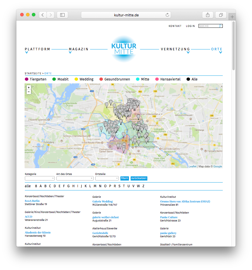
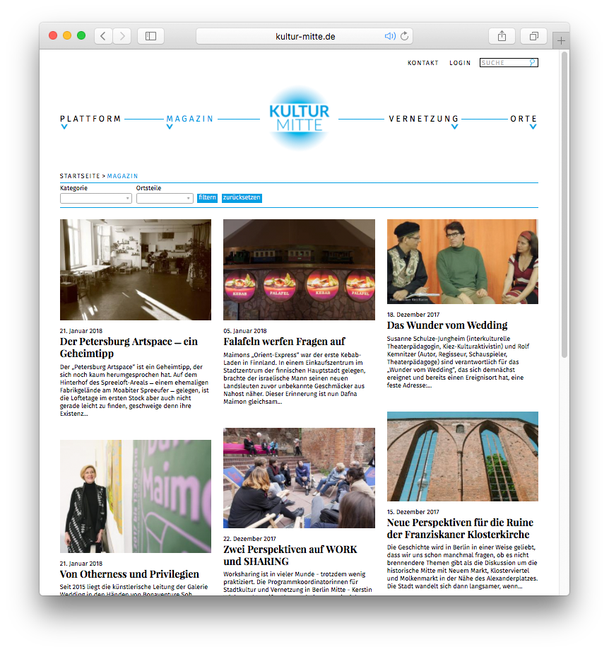
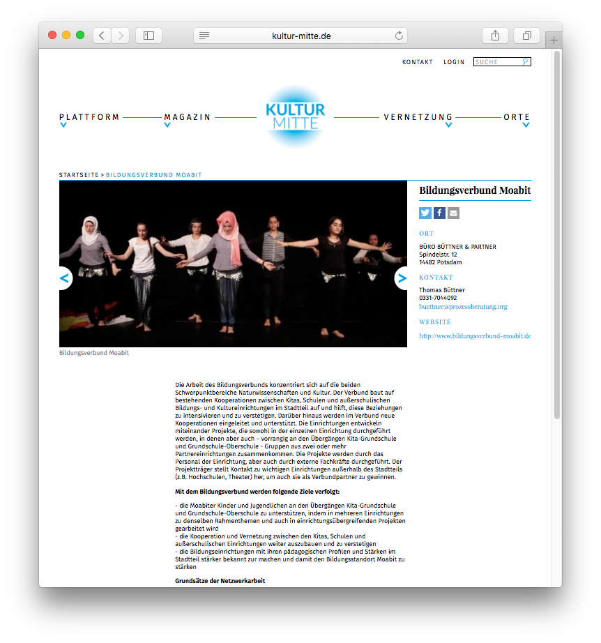

Kultur-Mitte is a cultural platform that offers all information about events, places, funding and others in the field of culture (“Kultur” in german) in Berlin Mitte covering six areas of the city.
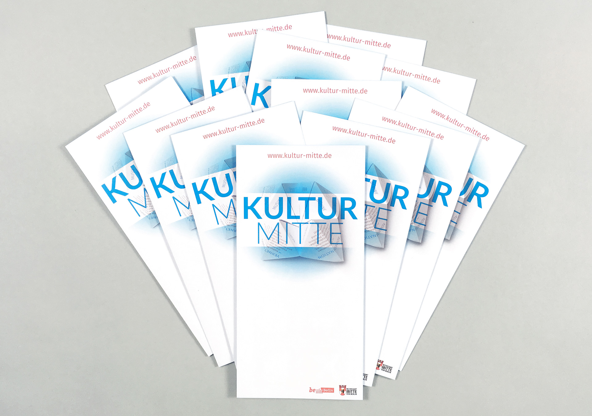
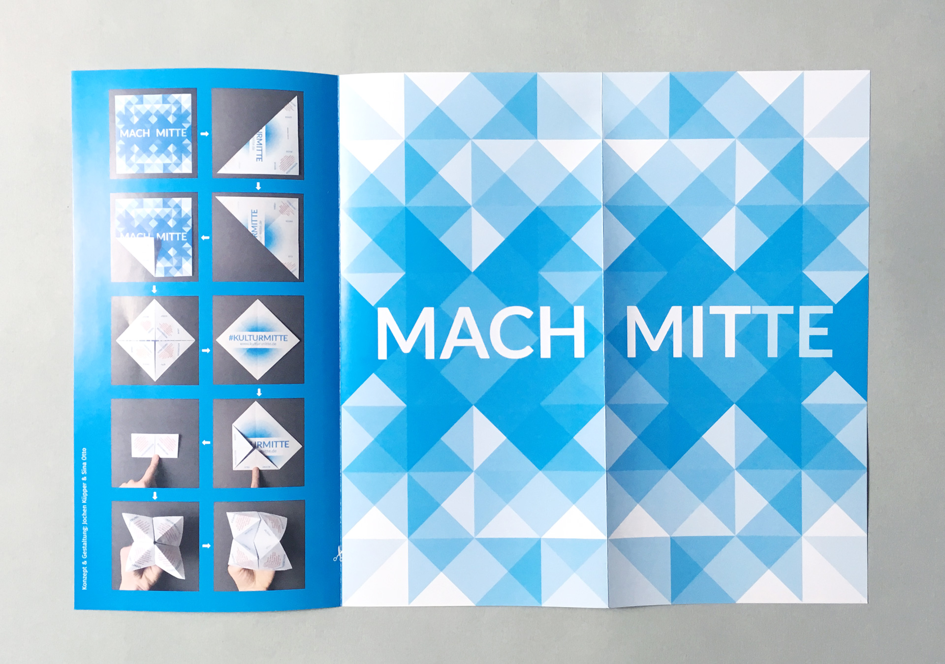
I was completely free in designing the website and additional media. Additionally, the editors Annette Wolter und Jochen Küpper suggested some conceptional solutions like hopscotch as base of a flyer and taking triangles for patterns.
Design of basic elements
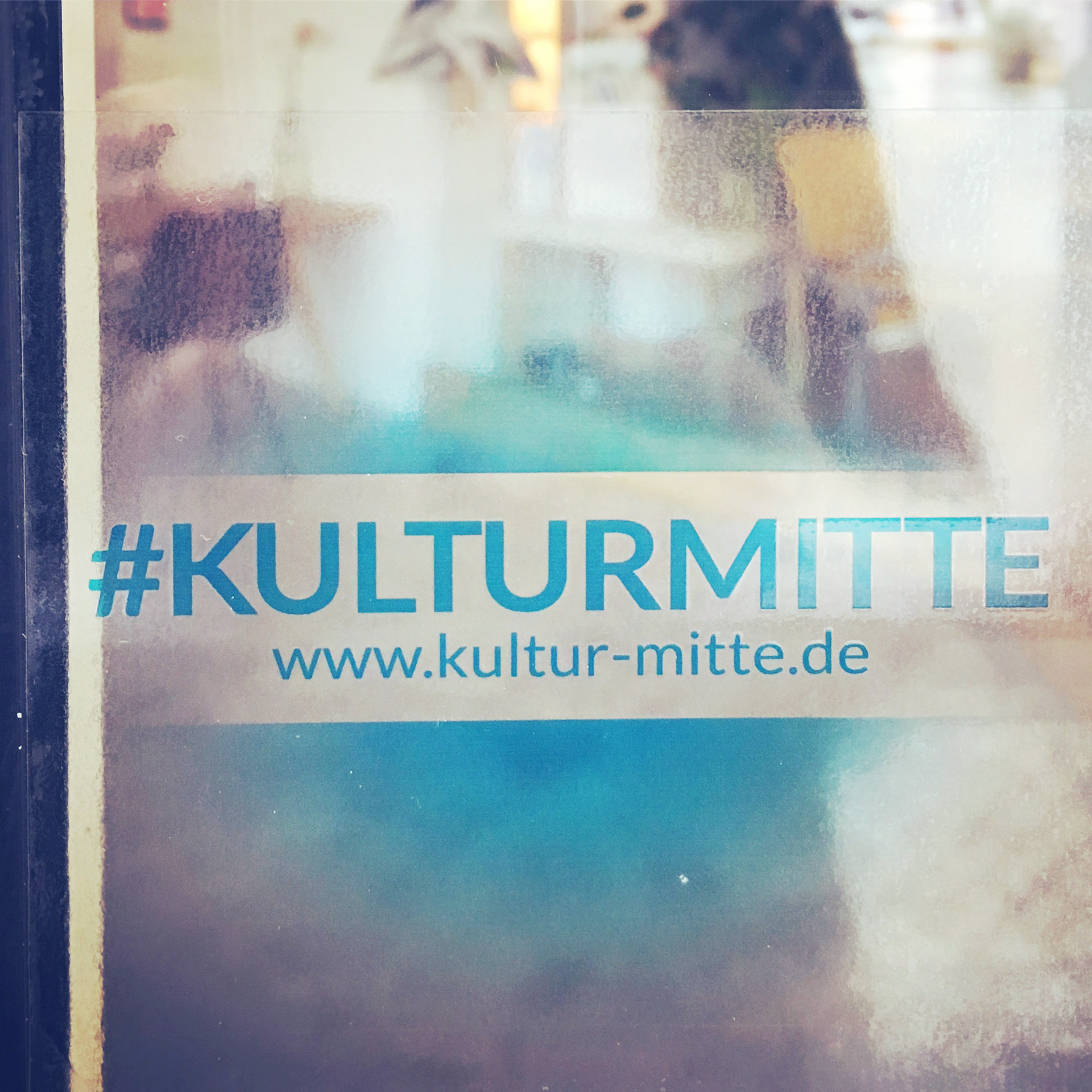
For the color I took into account that blue was used already before. Cyan is brightly now. With a bit of red it becomes edgy. Red is the corporate color of the city of Berlin. I used it in the flyer.
The logo transports the place Mitte and the subculture as a radial gradient where the name is placed centered on a stripe above. So it looks like left out when brushed.
The type is Lato, a young sanserif typeface. Warsaw based designer Łukasz Dziedzic designed it in the Summer 2010. “Lato” means “summer” in Polish. It’s classic with a lively and open touch.
I chose Fira as text type for print and web applications. It was originally designed of the Erik Spiekermann for Bundespost. The well known type designer reworked it together with Carrois Apostrophe (now bBox Type). This very legible sans serif typeface is also used on the website of english newspapers The Independent and Evening Standard.
To create a striking contrast I chose Playfair Display for headlines, subitems and links. The typeface was designed by Claus Eggers Sorensen from Amsterdam.
Additional design element
Further design element are the patterns from triangles. They are also a result of the folding of the flyer. On the website they are used as tiles where there is no specific image. With such a simple concept almost an infinite number of appealing patterns can be created and used in different way.
Here you can find the Website: www.kultur-mitte.de