Branding for the newspaper Cellesche Zeitung
CZ Logo
competence areas of CZ
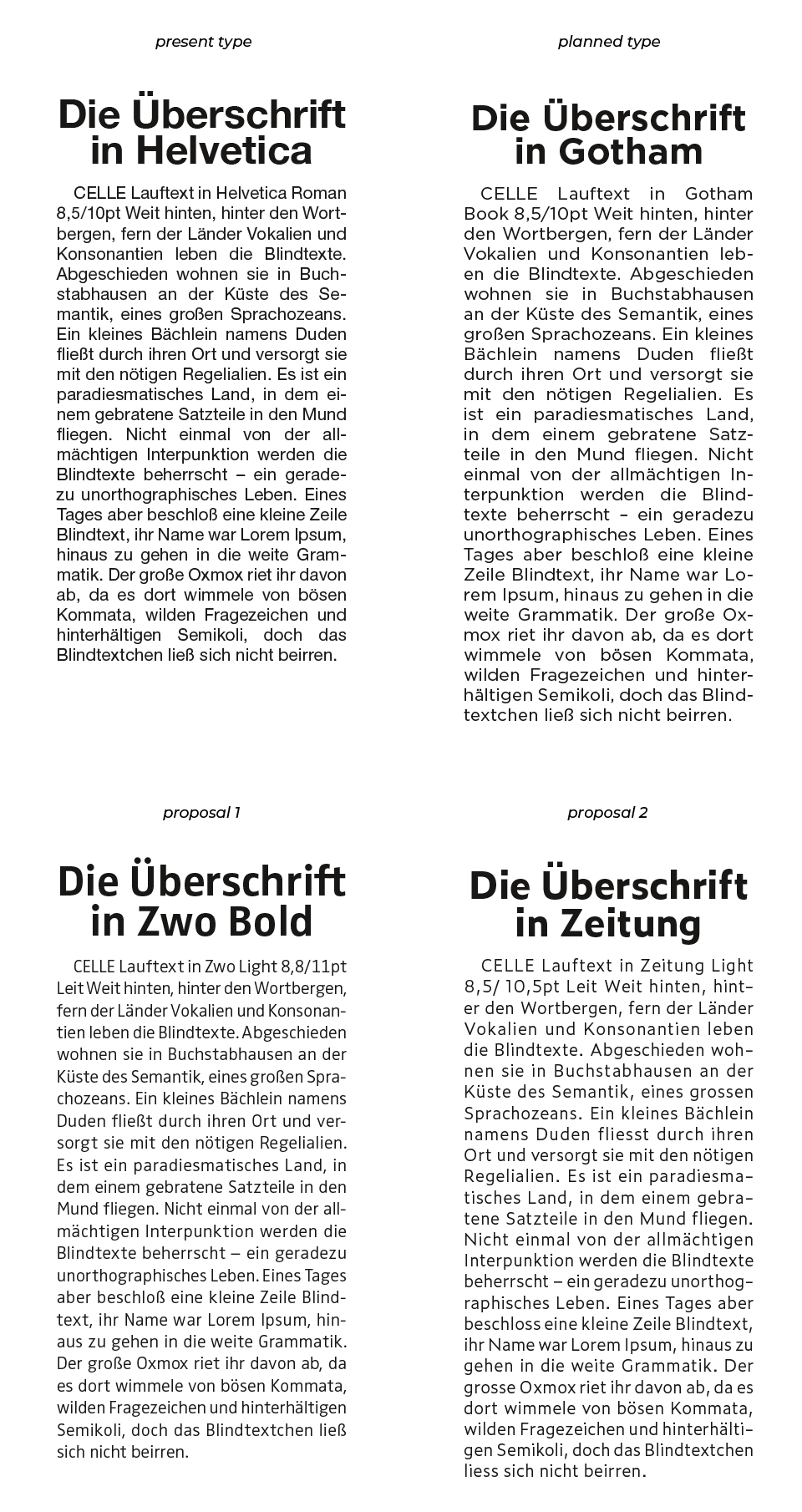
type test for article

type test for news columns
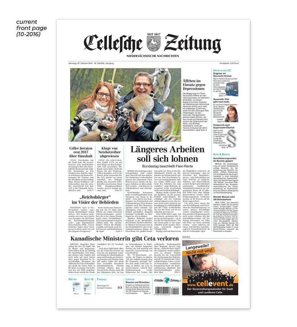
current front page (10-2016)
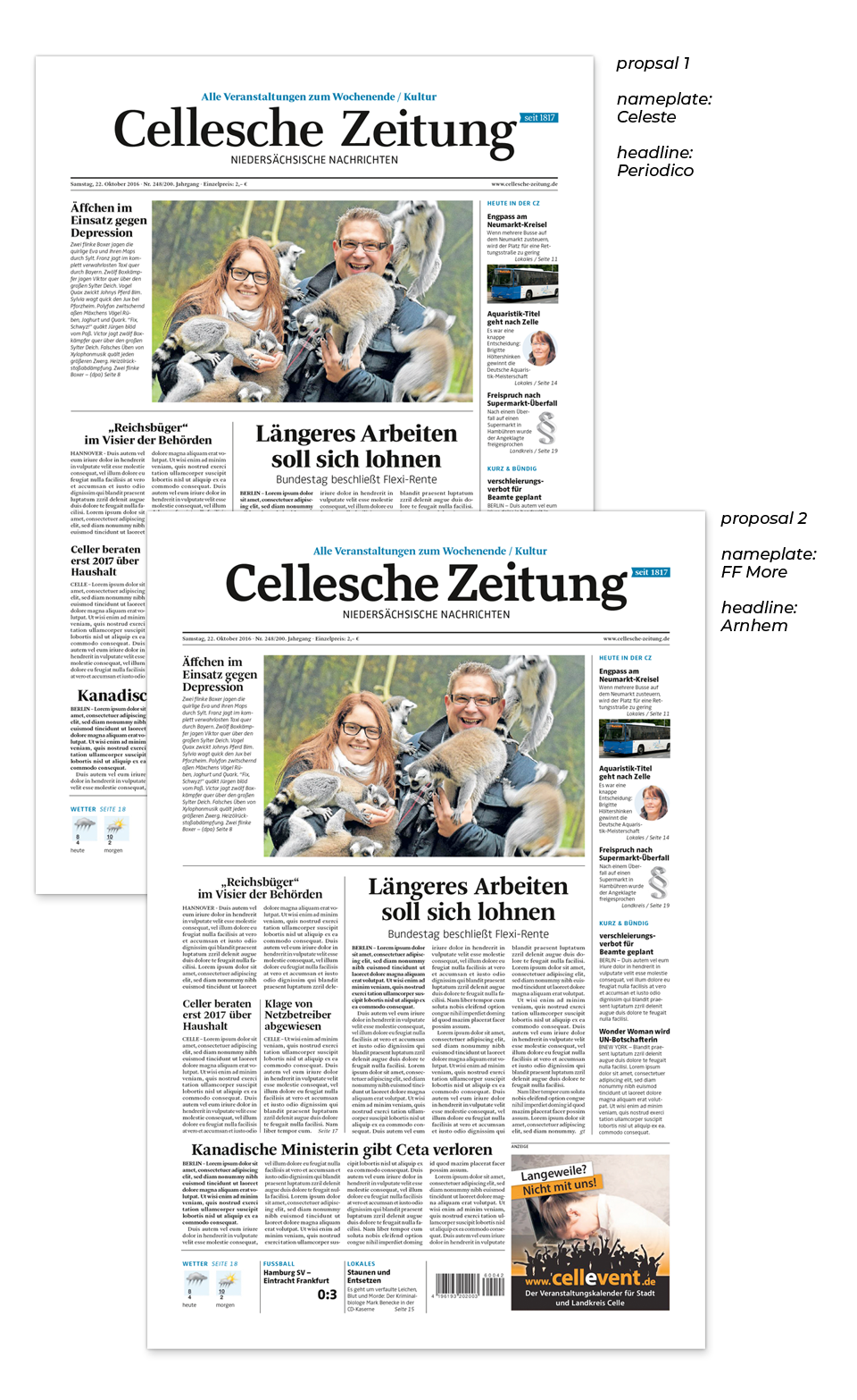
proposals for front page
development of the jubilee brand
jubilee brand - 200 years of CZ
style guide – cover

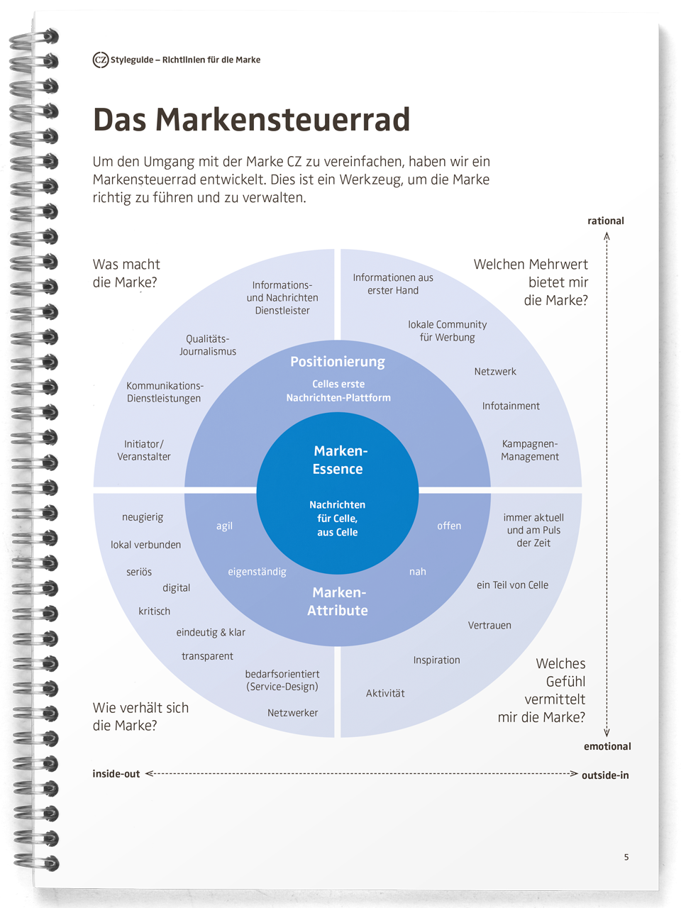
style guide – brand wheel
style guide – mission statement

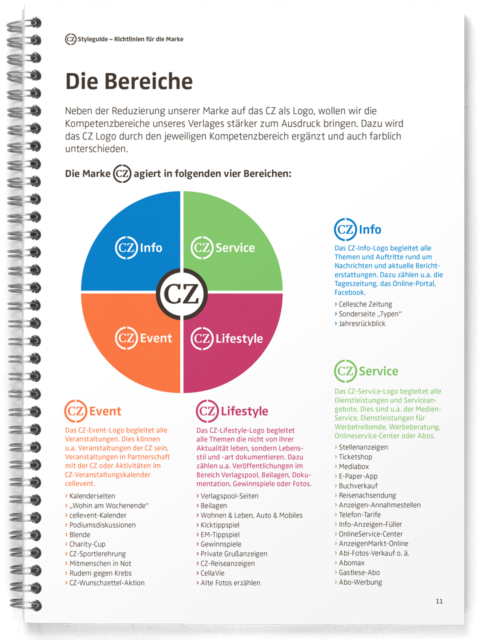
style guide – competence areas
style guide – construction of the logo

style guide – do's and dont's
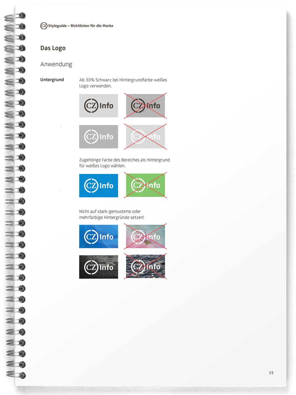
style guide – correct use of the logo

style guide – special forms

Within a corporate identity process, I developed a corporate design – branding – including a logo and a jubilee brand for the publisher of Cellesche Zeitung. That is the newspaper of the city Celle.
Cellesche Zeitung (CZ) gave the task to develop an identity to Hannover based agency Winkler & Stenzel. The independent brand strategy consultant Holger Ambroselli analyzed the identity. A brand wheel reflects on the brand – looking ahead into future. With this optimal condition he ask me to work on a CZ logo. That would not only stand for the newspaper but for all activities of the publisher beyond. I was also asked to create a corresponding corporate design with templates for ads and banners.
The logo
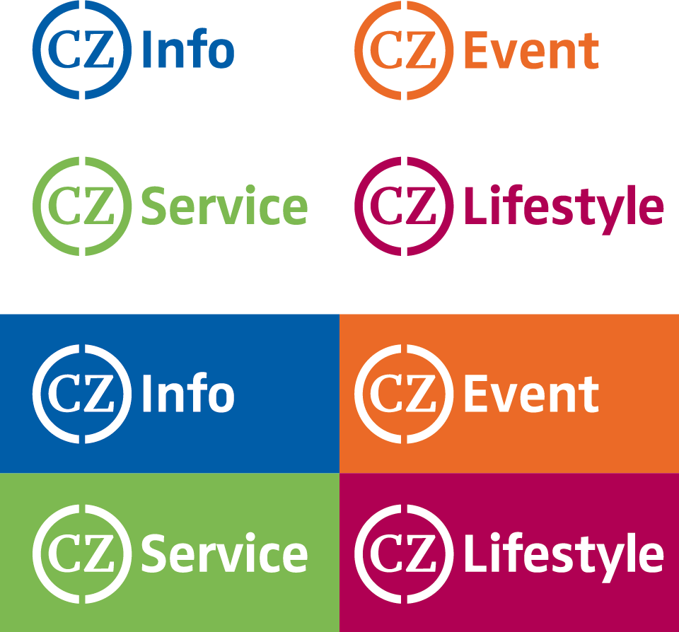
The CZ should stand distinctively on its own and in good combination to word mark of the competence areas info, event, service and lifestyle.
Different designs led me to the circle with a gap on top based on a newspaper loop. Finally the publisher wished also a gap below. Thereby the activity of the publisher was presented: information come in, are edited and go public as a new product.
As far as the colours are concerned, the publisher accepted the ones chosen by me. The intern creative apartment adjusted them in the end.
Cellesche Zeitung celebrated its 200s birthday in 2017. On this occasion, I created a jubilee brand that integrates the new logo in the number itself.
The layout and type
Also the newspaper itself should undergo a redesign. For this I submitted proposals relating mainly to the typographic aspect. For the masthead I suggested FF More Wide, which gained approval, and set also the CZ in that type font. Finally the head remained in the original blackletter without the arms.
The intern creative apartment redesigned the newspaper. The new chief editor wished to adapt the design from the newspaper Kieler Woche. The type font Mafra of DSType Foundry used for deadlines. Therefore I took Mafra Medium for the letters of CZ.
For the ads I chose the font FF Zwo. Consequently I set the words of the competence areas in the same style.
As special type I designed the numbering in the same style as the logo. I made the numbers available as a font set, so one can enter the glyphs on the keyboard.
Completion
The corporate identity process continued with co-creation-workshops for the new communication concept.
Finally I created a detailed manual together with Holger Ambroselli. Thereby the guidelines for the brand are defined beyond the visual appearance to give the staff a better self-conception.
(>)
You can find another corporate identity project here: University of Vienna