Type - Anima Regular - Glyphs

Type - Anima Regular - Waterfall

Type - Anima Bold - Glyphs

Type - Anima Bold - Waterfall

Type - Anima Heavy - Glyphs

Type - Anima Heavy - Waterfall

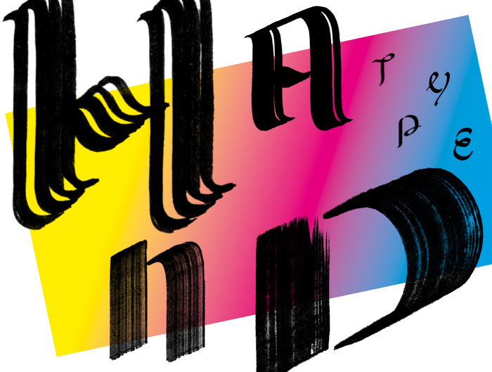
Type design is my passion, the font Anima is an own creation. It grew over the years and has eight styles.
The idea was to design an upright italic – so a roman with italic features such as upturned tails. The font Anima could be categorized as neoclassical or didone with high contrast between thick and thin strokes. It has balls (at the terminals). Optimal for editorial use or anything and anyone with a beautiful look.
The uppercase letters will get alternative glyphs with an italic character. Furthermore I will created also a real italic typeface. And some more glyphs.
Uppercase Cyrillic is the latest add-on.
The project started in a self initiated lettering workshop with Martina Flor. Followed by type design in the class of well-known type designer Lucas de Groot, where is I advanced the font Anima. (Studio LucasFonts developed fonts for newspapers and brands such as TAZ, der Freitag, Volkswagen, Heineken, Miele and many more.)
See here for the start of the type process – under the name Schöneberg.