DB mobil magazine
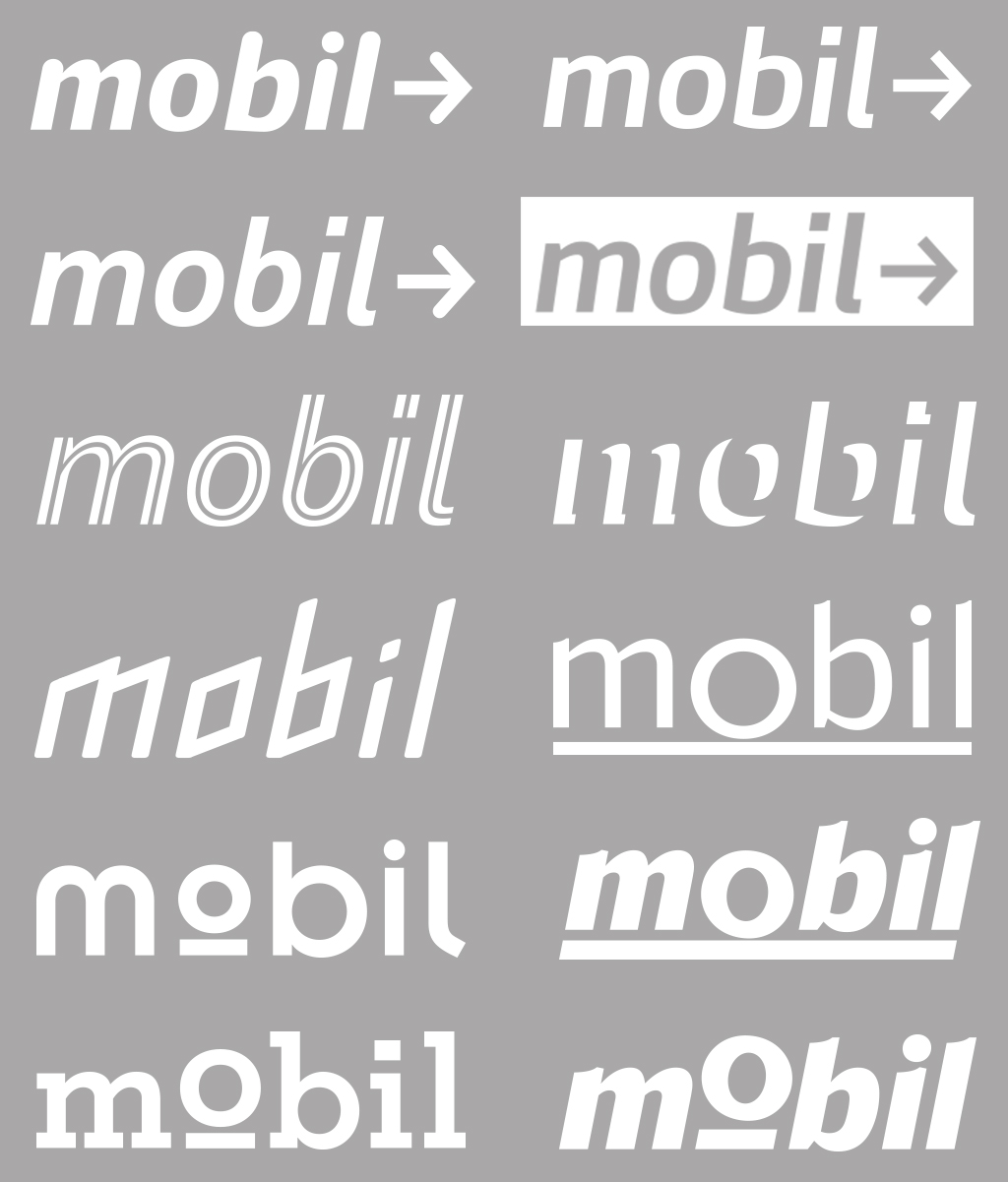
The art director Lo Breier asked me to design the logo for mobil – the magazine of Deutsche Bahn. It was when the biggest german publishers pitched for the magazine mobil. Until then it was in the hand of Gruner + Jahr.
We worked with the corporate font DB Head but also on new designs.
Gruner + Jahr won the pitch. The logo was set in DB Head Black (before it was Black Italic). Mobility (railway) was symbolized through an underlined, circular “o”, which was used also as an icon.
(>)
See the latest project of logo design: APG – Identity for a tax consultancy