Center for societal progress
Agency
Uforepublic : Frankfurt
Category
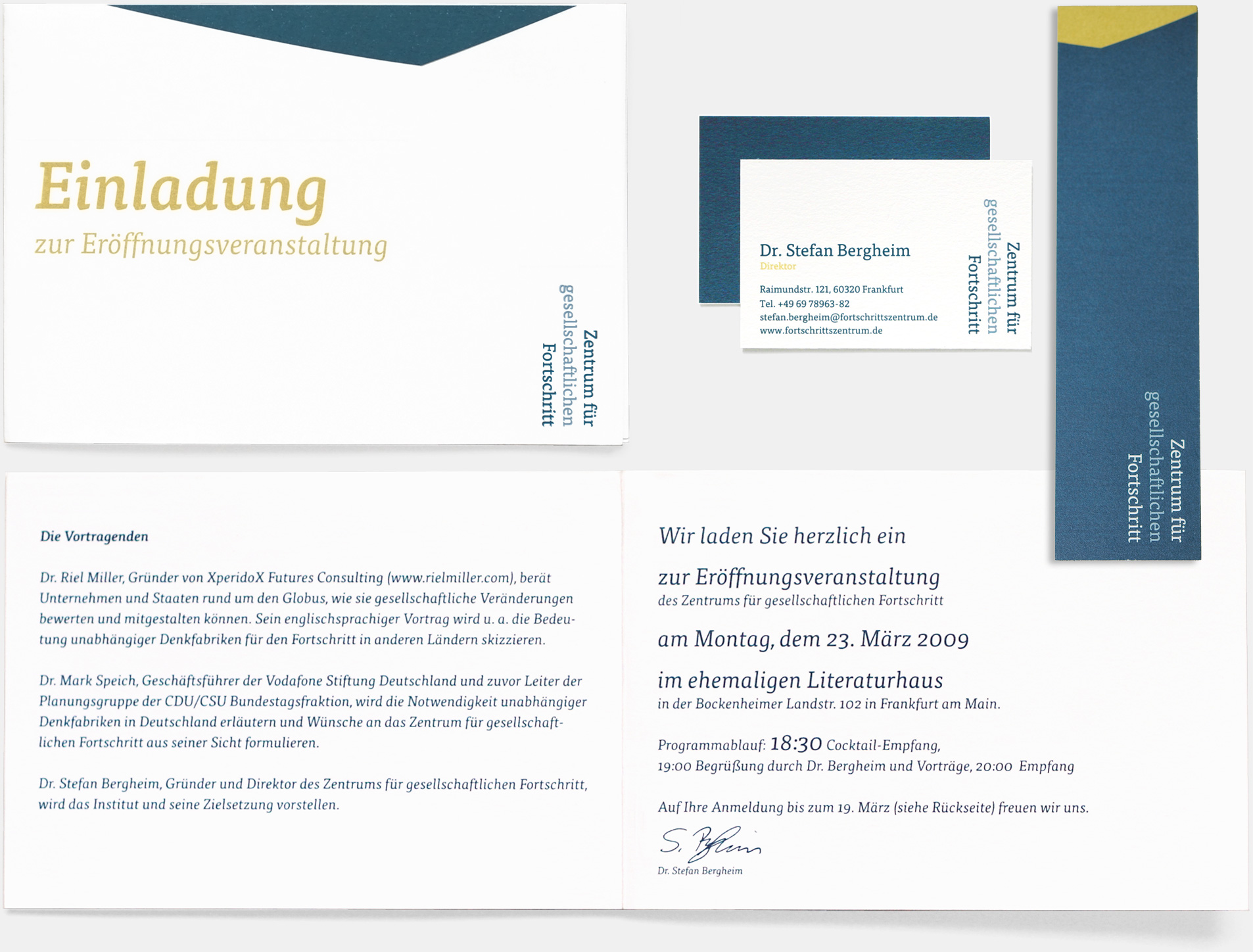
IDENTITY, LOGOThe unusual position and turning of the logo is due to the fact that the Center for societal progress – as an independent think tank – beholds developments or comparisons from another (wider) point of view, which is often illustrated with charts. Blue is used to emphasise the reliable character of the institution. As an accent, a cold yellow is added in applications.
The new typeface Tisa is a softer, more dynamic version of a slab-serif. It’s highly legible in text and has a very interesting character in larger font sizes.
A former version of the development provided an emblem whose onion-shape indicates an interlacing of working fields and another single form illustrating openness. Out of this mark derived a graphical element applied in applications such as invitation, representations etc.