F&P FiboNet – Branding
The branding for F&P Fibonet was an extensive work of developing the basic elements such as logo and diverse material.
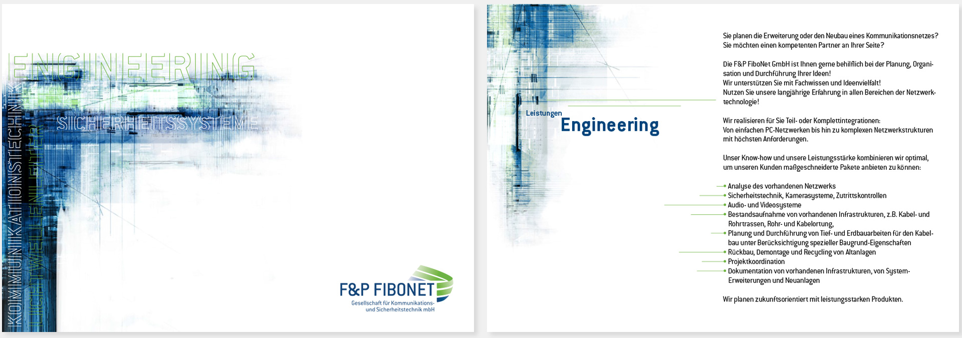
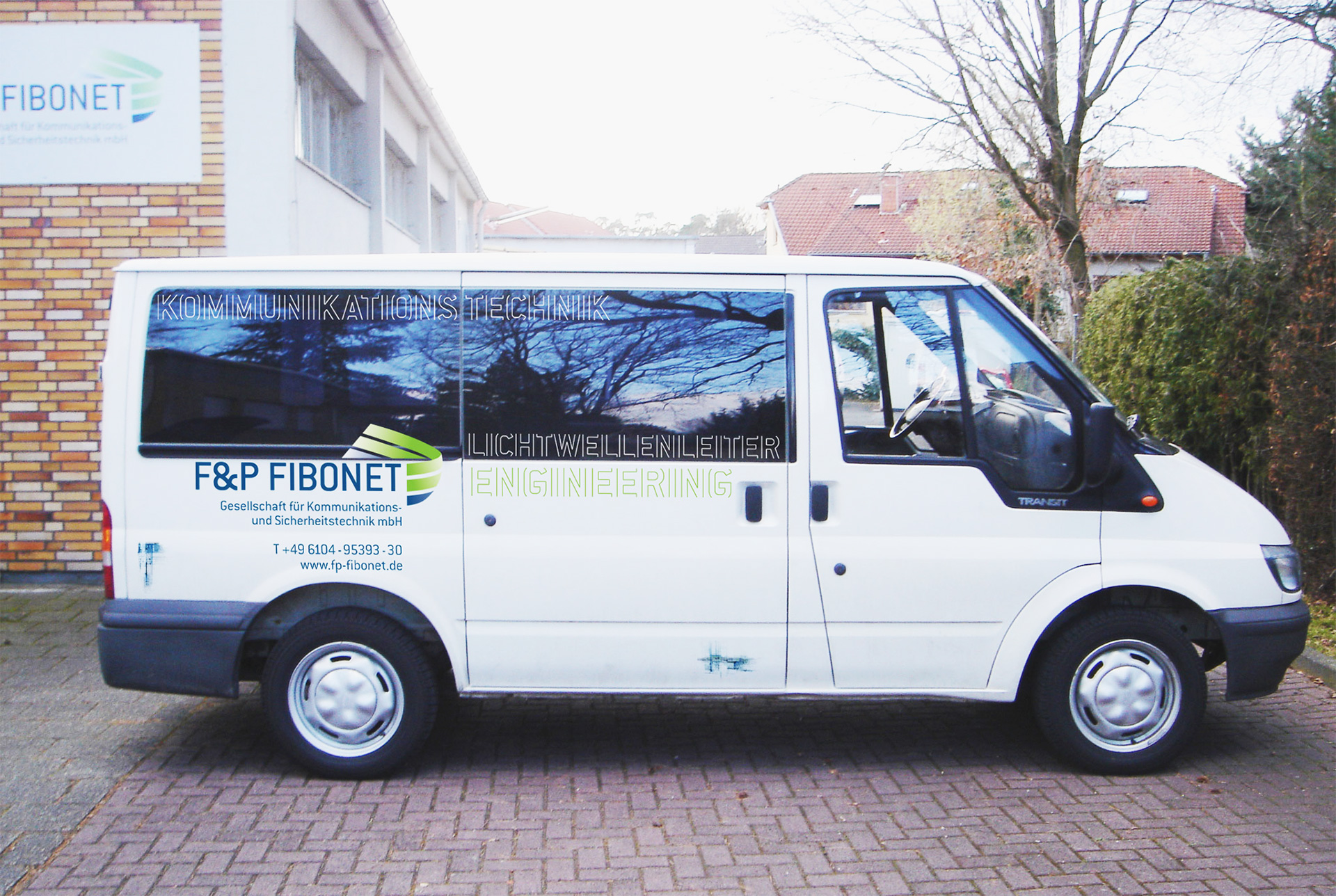
As F&P Fibonet is a company dealing with communication technology and safety engineering with a high-quality service, the visual appearance had to be dynamic, technical, stimulating, functional and friendly.
The two partners asked Uforepublic to convert their logogram (F&P) into a symbol that could stand alone. A great number of versions were presented. One of my designs in particular appealed to the client. It was finalised by a colleague.
I chose the typeface Conduit for the logotype that additionally became the corporate font.
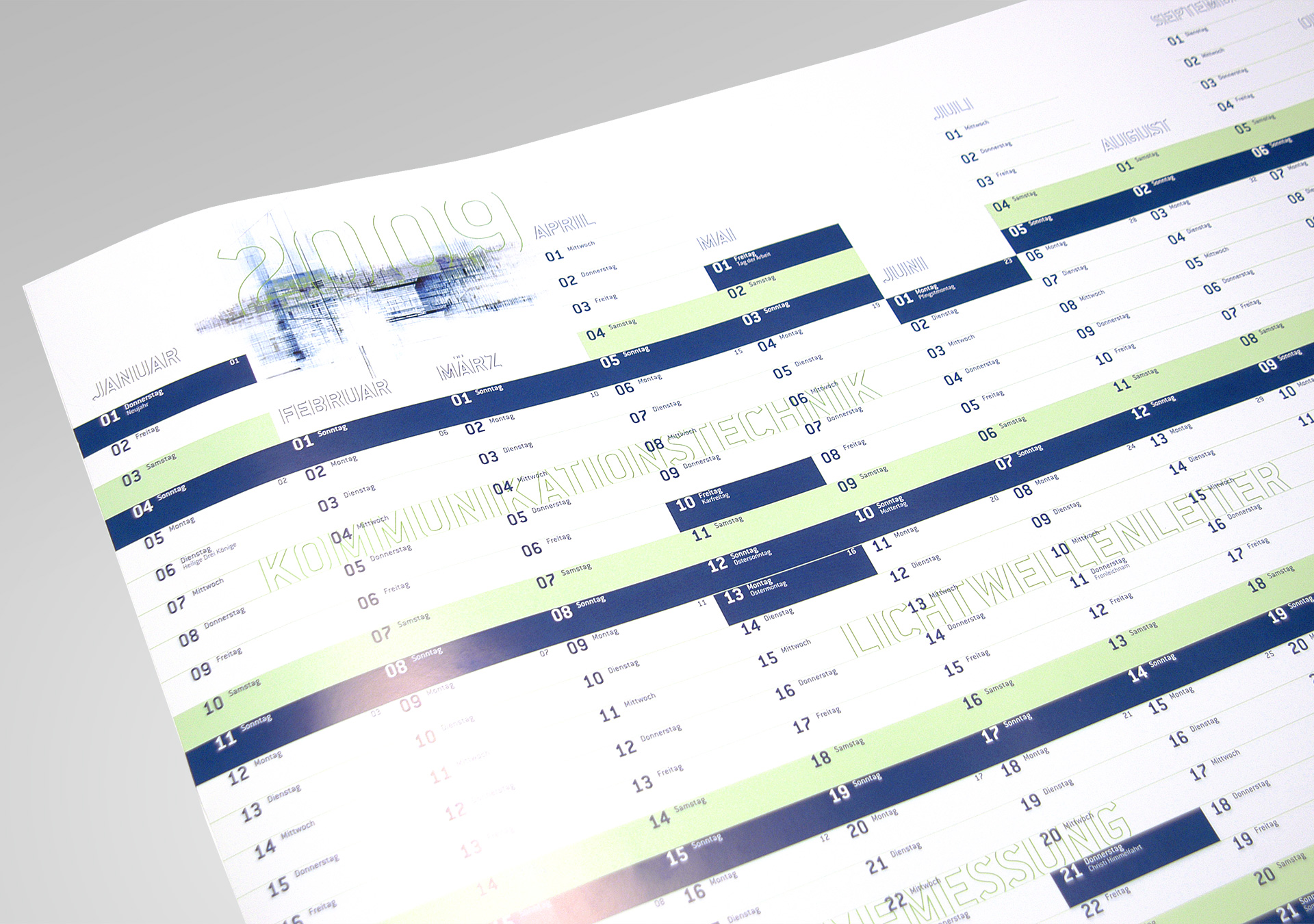
A further element of the corporate design is an artistic illustration, which I adapted to the applications. Letters were set in outline – open to the top and down to indicate the cable they are working with and to obtain a fresh look.
(>)
Another extensive corporate design project: University of Vienna
Agency
Uforepublic, Frankfurt