
The agency Bluetango in Vienna got the brief to analyze the view towards the brand. Furthermore to make recommendations regarding the vision and mission. Therefore Bluetango hired the art director Lo Breier. So he took me on board to guide the visual communication.
My work began with an extensive research on visual appearance of universities worldwide.
As far as the concept is concerned, there was an intense phase of the side of Bluetango with Johannes Newrkla and the communication department of the university with Elisabett Mattes. The visual appearance should become more modern, more likeable and more visible – taking into account the values tradition, innovation and diversity.
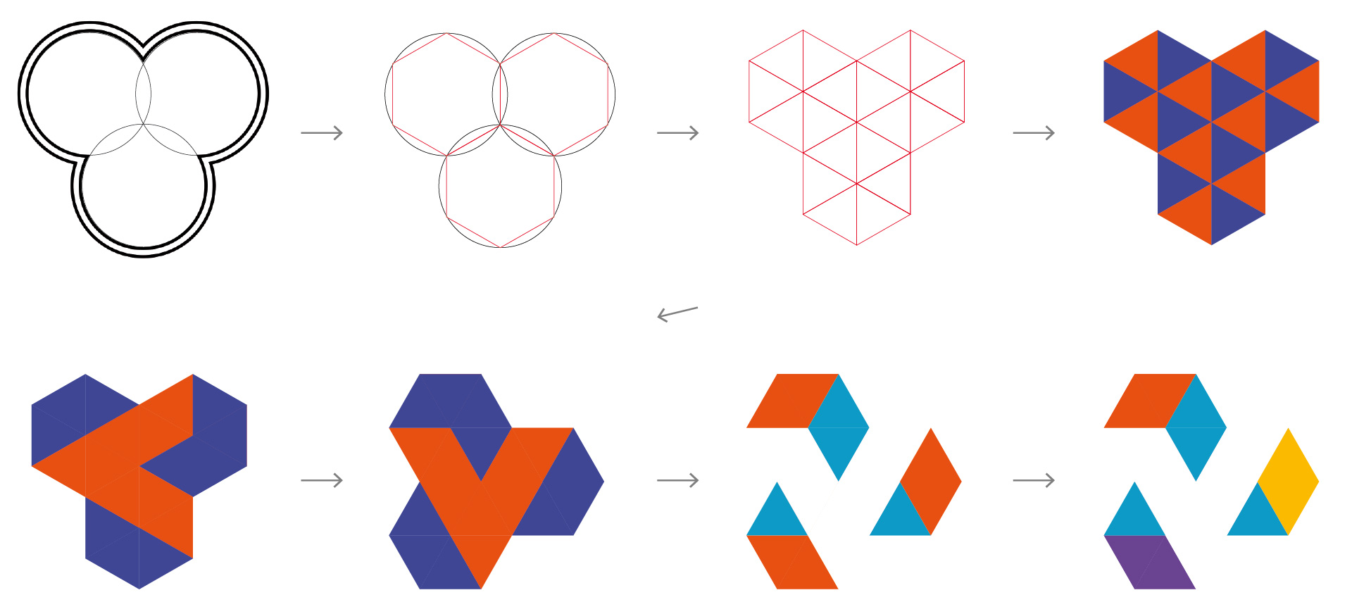
The new colors should have a festive and elegant connotation. My choice of a blue-turquoise as main color (similar to the former corporate color but warmer), a blue-violet, yellow and orange-red was determined quickly. They were used in other media later on while they remained exactly as I had suggested.
During the next phase I created the logo which the vice chancellor and the communication department liked immediately. As its basis, I took the trefoil that can be found in the historic symbols of the university. You can also see open books in the triangles and rhombuses which frame the “V“.
As far as the type is concerned, the choice fell on the font family Fedra.
Over the following months we developed various applications (stationary, the website etc.). It went through presentations in different committees. In the meantime, poster series with the present logo were implemented.
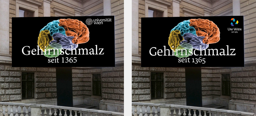
In August 2013, the senate refused the implementation of the new brand. Just the new colors were accepted – also for the jubilee brand I designed.
Then we were commissioned to work on a redesign.