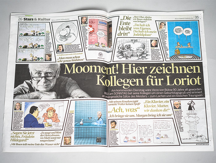
Archive

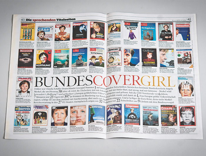
BILD am SONNTAG* is the biggest German Sunday newspaper. Veronica Illmer und Helmut Steindl alongside Lo Breier were part of the art direction until the end of 2013. The middle part, the guide (Ratgeber), was usually produced during the week. The centre spread featured the so-called speaking...

Since October 2013 Marion Horn superseded Walter Mayer as editor-in-chief at Bild am Sonntag* (BamS). Saulo Santana started to work as art director. With the staff turnover, a new plainer layout was introduced. In the case of special events, pages have to be created very quickly,...

[vc_row css_animation="" row_type="row" use_row_as_full_screen_section="no" type="full_width" angled_section="no" text_align="left" background_image_as_pattern="without_pattern"][vc_column][vc_column_text]Kultur-Mitte is a cultural platform that offers all information about events, places, funding and others in the field of culture (“Kultur” in german) in Berlin Mitte covering six areas of the city.   I was completely free in designing the...

To mark the occasion the 25th anniversary of the fall of the Berlin wall, Atlantic Times published a special edition. The monthly newspaper mainly addresses the readers in the US and is available at authorities, such as embassies and the White House. A small team...

I design lettering with love – an individual lettering for a wedding as an illustration for an invitation card or as a present. Here you see letterings I created as a present for weddings.   Murat & Idil   Franzi & Kai   Here you can find commissioned letterings. And a lettering for...

More than simple logo design, I create individual lettering: logos for small and big businesses, for gastronomy and cultural sector and private events. Here you see some commissioned letterings.   Vanoush – fashion label Jumpsuits true to the motto: „Get Comfortable, Go Natural, Be Yourself, Get Free!“ – find on...

[vc_row css_animation="" row_type="row" use_row_as_full_screen_section="no" type="full_width" angled_section="no" text_align="left" background_image_as_pattern="without_pattern"][vc_column][vc_column_text]The stylistic elements of MINI are well defined. There is much space for ideas whereas the “tone of voice” is always with a little wink, bold and ironical. The main attribute of the brand is enjoyment (spontaneity, extraversion...

[vc_row css_animation="" row_type="row" use_row_as_full_screen_section="no" type="full_width" angled_section="no" text_align="left" background_image_as_pattern="without_pattern"][vc_column][vc_column_text]20 Austrian or Austria-based designers were invited to submit ideas for the competition “Postage Stamp Europe”. Lo Breier was one of the selected designers, who created this stamp with me. The motto was “Europe – an old love story”.   Our...