Archive

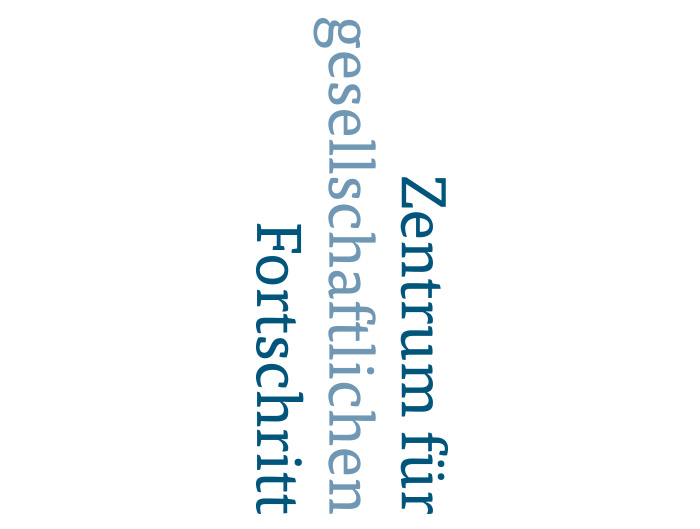
The unusual position and turning of the logo is due to the fact that the Center for societal progress – as an independent think tank – beholds developments or comparisons from another (wider) point of view, which is often illustrated with charts. Blue is used...

The branding for F&P Fibonet was an extensive work of developing the basic elements such as logo and diverse material. As F&P Fibonet is a company dealing with communication technology and safety engineering with a high-quality service, the visual appearance had to be dynamic, technical, stimulating,...

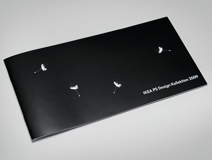
The agency Uforepublic in Frankfurt, were I was working at as an Art Director, was commissioned to produce a catalogue for the IKEA PS design collection. 46 products by 20 designers were exhibited in a gallery in Hamburg. The only requirement for the catalogue was the use...

[vc_row css_animation="" row_type="row" use_row_as_full_screen_section="no" type="full_width" angled_section="no" text_align="left" background_image_as_pattern="without_pattern"][vc_column][vc_column_text]In the winter term 2006/7 I studied at University of Plymouth in the Faculty of Arts in Exeter. There were four projects I took part in. In one class we were asked to create a limited edition book celebrating the jubilee...

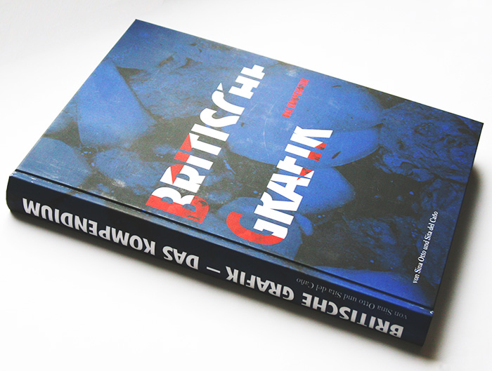
[vc_row css_animation="" row_type="row" use_row_as_full_screen_section="no" type="full_width" angled_section="no" text_align="left" background_image_as_pattern="without_pattern"][vc_column][vc_column_text]The book about british graphic design started as part of a course at the University of Applied Sciences in Mainz. In 2007, I researched Britain's design scene in a small group of students. Thereby arised a huge archive...

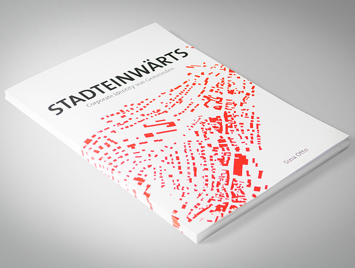
[vc_row css_animation="" row_type="row" use_row_as_full_screen_section="no" type="full_width" angled_section="no" text_align="left" background_image_as_pattern="without_pattern"][vc_column][vc_column_text]The award winning book shows the development of corporate identity of towns.   More and more municipalities change their visual appearance. For a professional approach of their corporate identity however, there are insufficient funds available. That indicates a lack of...

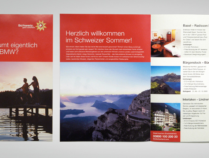
[vc_row css_animation="" row_type="row" use_row_as_full_screen_section="no" type="full_width" angled_section="no" text_align="left" background_image_as_pattern="without_pattern"][vc_column][vc_column_text]During my apprenticeship as media designer I did the changeover from the old to the new design and created various material (ads, poster, flyer, leaflets, catalogues etc.) for Switzerland Tourism. A leaflet that I created in accordance to...