In the interview, designer Oliver Maltby talks about british graphic design, humour in design and about working in the financial crises. As part of a research project about british graphic design (see book) I interviewed several creative directors in London in 2009. Back then Oliver Maltby used to work for the chase.
Interview with Oliver Maltby
What’s british design for you?
OLIVER MALTBY: It is very difficult, I think british design is a lot more. It is quite quirky.
So do you think it is not obvious?
OM: Sometimes yes. It is really hard to say british design is design like this. You get the typographs side like Frost, Alan Kitching, Johnson Banks and kind of early Pentagram’s. But Pentagram does different work now. It is very classy, but then they do much concept in different work, that is why they started.
When you look at american design, it seems for me kind of did not change in the last ten years. It’s all very typographic, but it almost seems the decade is over. Wheras, as you go to Scandinavia, in general it is very typographic, not much about the idea. It is all about beautiful layouts, very clean grids. That’s the main difference: I think England is more focused on ideas, more quirky generally compared to other nations. That’s why we did that. There are typographers in England the same as in different places, but it seems that’s where are the abstract thoughts.
Actually that’s what we thought about: The form arrises from the content. The image and the text transports the message. That’s what we [in the pre-version of the book] call conceptional design.
OM: Yes, exactly. In our office it is like that: it is not style what is all about, but the message, boiled to a very simple means of communication and then the style, the form, before everything else. If you look a round, the style is so different, but the thing is every work is based on a very simple idea. It is never the same idea.
He shows me some of the work of The Chase and we talk about a few.
OM: English design is very more unpredictable than in most of the world. There are so many different influences. It is the geography of England, you know, we are a nation of immigrants, everyone is from somewhere. It is such a mix; in fashion, design, even in modern art. In terms of fashion, Italy and New York are leading. When it comes to quirky design everyone is looking to London. It is such a melting pot with so many different influences.
Backwards in the sixties design was on a low point. They did not know what to do but they were only a few designers who tried to push it and recommended to look at Switzerland and the US. Do you think british design might be a mix between american and swiss design or is it a completely other visual language for you?
OM: It is different. I don’t know if it is only an english point of view, but I think the godfather’s of modern graphic design are at Pentagram which are formed from two english guys.
Yes: Alan Fletcher, Bob Gill and Forbes. One was American.
OM: Bob Gill. So they started modern graphic design. In most graphic design, even typography styles of scandinavian design, everyone looks to Pentagram at a reference point in history.
Still?
OM: Yes, definitely. Maybe more the older stuff. They are still very well regarded.
Over the years, it might sound brutal, but the Americans don’t offer too much. I wouldn’t say it is a mix between Americans and Scandinavians, I mean the Americans delivered a lot, but England delivered the most, but then Scandinavians are brilliant in typography.
I discovered some type designers some month ago. Anyway.
We had three categories. To begin with handmade typography such as letterpress. Actually letterpress is still taught in universities as I could experience myself.
OM: Yes it is.
It is so british. You can barely find it in Germany.
OM: Yes I think it is a bizarre thing. It will die out. Due to former industry you have to learn it. I don’t think it is that important. It depends where you go and come from. We are very conceptional. It’s about ideas. You should also be aware of the technique. This field won’t be important in the future.
We look at work in the reader, especially what we called illustrative (The Designers Republic, Neville Brody usw.).
OM: At this point I have to say that’s why I went into graphic design: it was because of David Carson’s work. What you see here is very half of this.
Yes, it’s less about a concept. It’s playful.
OM: They wouldn’t have that in the US.
It is funny but I wouldn’t say it is typographical, I mean you have a lot of typographic examples here, but I would say british design is a real mix.
Have you seen the book “a smile in the mind”?
No.
OM: I’ll show you.
He goes and gets the book.
OM: I think in a way this proves that it is about a lot of different ideas and that is not necessarily typographical. This is quite popular around english designers using kind of comedy, humour in design.
That is what our last chapter is about. Some of the things we found are still missing.
We have a closer look.
OM: There are some very good examples of english design.
Something else: some questions came up from the latest economical developments. Concerning the credit crunch: Can you see that it is a problem at the moment?
OM: Everyone is concerned – about wages, job security. Everyone is nervous, more aware, more careful what they spend. In terms of work, small projects are pretty hard to find. We are not hit so far.
Actually I just became a freelancer and people are wondering if it’s a good time.
OM: I get a lot more calls. Companies are a lot more careful about expenses. People just work longer, because they don’t know what is around the corner.
So does it not influence the visual language, I mean that customer want it in another way?
OM: Not really. It stays the same, we still try to communicate.
Do you think the visual language is characterized by the cultural background? I mean handcrafts for example?
OM: It always remains the same to some extend. It depends how educated you are and how independent a company thinks, having a clear vision and what you want to achieve with it.
Another question: Have you heard about the manifesto?
OM: Ah Ken Garland. It was revised by other designers a few years ago, wasn’t it?
Yes. Do you think it had an influence or was it an outstanding idea, a more political way to think?
OM: I think it is very difficult. From what I remember it is about not working on certain things you don’t agree with. It is like an ethical status. Generally, graphic designer is commercial in practice. Ethics will drop way aside. It is like you can effort to eat organic food or you can’t. It depends on the circumstances, a lot on the expenses and on the budget. So I think it is the same with this. It is a great idea, but I know a lot of companies who would stick on the cigarette packaging. At the same time doing charity work. I know an example from the area of mining.
All companies should know what they are doing or what not. I like the kind of idea, but I think if you are a practising designer there are a lot of issues. As a designer you have to find pros in every kind of work.
Further interview partners of the series: Harry Pearce, Angus Hyland, Thomas Manss
“British design is quite quirky.”
Oliver Maltby
• • •
About Oliver Maltby
Oliver Maltby was the Creative Director of The Chase in London, where he helped to make it the most creatively awarded design agency in the world. There, he was responsible for managing and developing brands for a host of FTSE 100 clients including AstraZeneca, Inmarsat, Land Securities, Pearson and Rio Tinto, as well as national institutions such as the BBC, British Council, Marks & Spencer, Orange, and Transport for London.
In 2012, Oliver joined Interbrand.
Throughout his career Oliver has been consistently recognised by a host of creative awards in numerous categories. Over the last decade he has amassed more than fifty national and international awards.
(source: www.tractor.edu.au)
He is residing in New York (status as of 2018).
(source: www.olivermaltby.com)
• • •
Bilder
1) Oliver Maltby
2) Branding for Yorkshire Water
3) Sheet for The Manchester Evening News, 2007
4) Branding for The Co-operative Bank
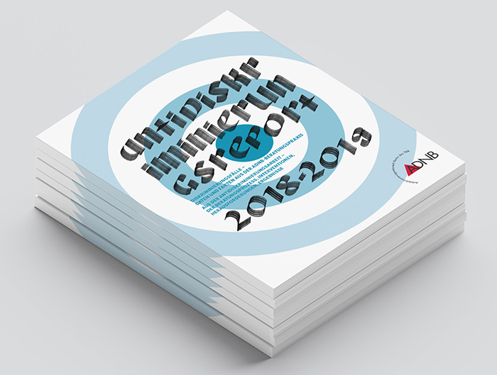
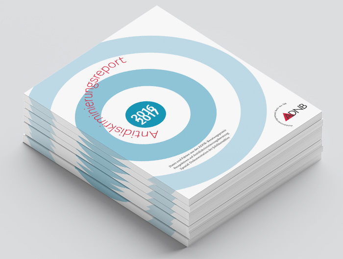
5) Brochure for The Council for the Registration of Forensic Practitioners (CRFP)
6) Logo and brochure for 40 Eastbourne Terrace
(The Chase www.thechase.co.uk, www.tractor.edu.au)